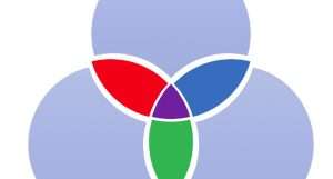
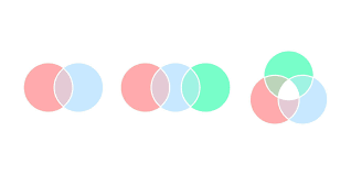
Intersection color is a fascinating concept that plays a pivotal role in multiple fields such as computer graphics, data visualization, mathematics, and even philosophy. The term primarily refers to the visual representation of overlapping elements or sets, where their intersecting parts are denoted using distinct colors to highlight relationships and shared properties.
This article explores the various aspects of intersection , including its theoretical foundations, applications, and potential future developments.
The Concept Behind Intersection Color

Intersection color is derived from the principle of highlighting relationships between overlapping objects or sets. In Venn diagrams, for example, the overlapping regions are often shaded or colored to indicate shared elements. Similarly, in digital design and animation, intersection is used to emphasize areas where objects overlap, thereby adding clarity and enhancing visual appeal.
The concept can be extended to various domains, such as:
- Mathematics: Representing shared data points in set theory or graphing.
- Design: Creating visually compelling overlays in graphics and interfaces.
- Data Visualization: Clarifying relationships in complex datasets.
Mathematical Foundations
In mathematical terms, intersection stems from the theory of sets, where the intersection (denoted as A∩BA \cap BA∩B) represents elements common to two or more sets. To visually represent this, distinct colors are often assigned to each set, and the overlapping area gets a mixed or combined color. This approach simplifies the understanding of complex relationships and aids in problem-solving.
For example, if Set A is represented with blue and Set B with yellow, their intersection would traditionally appear green in additive color systems. This principle is applied in various mathematical visualizations, making abstract data more accessible.
Applications in Computer Graphics
Intersection color finds significant use in computer graphics, particularly in rendering and compositing. In these fields, it is utilized to create realistic scenes by simulating light interactions, transparency, and material overlays. The intersection of colors in digital imaging often involves blending modes, such as:
- Multiply: Darkens the overlapping areas by multiplying pixel values.
- Screen: Lightens intersections by inverting and multiplying pixel values.
- Overlay: Combines multiply and screen modes to emphasize intersections.
These techniques enhance visual depth and realism, making intersection an essential tool in graphic design and animation.
Data Visualization and Intersection Color
In data visualization, intersection color plays a crucial role in representing relationships in datasets. Overlapping elements in charts, such as bubble charts or scatter plots, often utilize intersection to show density or shared data points. This technique is particularly useful in:
- Network Graphs: Highlighting shared connections between nodes.
- Heatmaps: Representing overlapping data intensities.
- Geospatial Maps: Visualizing overlapping regions or territories.
The effective use of intersection color improves data readability and enables viewers to draw insights more efficiently.
Importance in Design and Art
Artists and designers frequently rely on intersection color to create visually appealing compositions. In art, overlapping colors evoke a sense of harmony, movement, or contrast, depending on the desired effect. Designers use intersection to:
- Guide Focus: Draw attention to overlapping or central elements.
- Enhance Aesthetics: Add vibrancy and complexity to designs.
- Communicate Relationships: Show connections or interactions between design elements.
For example, in user interface (UI) design, intersection can be employed to indicate selected states, hover effects, or layered components, ensuring an intuitive user experience.
Intersection in Printing
In traditional and digital printing, intersection color must account for the subtractive color model (CMYK), where overlapping colors often result in darker shades. Understanding how colors mix in this context is vital for producing high-quality prints.
Printers and designers carefully adjust colors to avoid unintended muddy intersections, ensuring clarity and vibrancy in the final output. This precision is particularly crucial in projects involving:
- Layered Text: Overlapping fonts or graphics.
- Complex Patterns: Designs with intricate overlays.
- High-Fidelity Reproduction: Art or photography requiring exact color representation.
Philosophical Interpretations of Intersection Color
Intersection color also has philosophical implications, particularly in theories of perception and representation. Philosophers have long debated the nature of colors and their existence as physical or mental phenomena. Intersection adds another layer to this discussion by exploring how overlapping perceptions are processed by the human mind.
From a symbolic perspective, intersection can represent:
- Unity in Diversity: Overlaps as shared spaces between distinct identities.
- Complexity in Relationships: Highlighting interconnectedness in seemingly separate elements.
- Dynamic Interactions: The fluidity and changeability of intersecting concepts.
These interpretations make intersection a compelling subject not only for scientific inquiry but also for philosophical exploration.
Challenges in Intersection Color Usage
Despite its numerous applications, using intersection color pwvip4d effectively poses several challenges:
- Color Perception Variance: Different viewers may perceive colors differently based on factors like lighting, screen calibration, or visual impairments.
- Overcrowding: Excessive use of overlapping colors can confuse viewers instead of clarifying relationships.
- Contrast Issues: Poor choice of colors may lead to indistinct intersections, defeating the purpose of the design.
To overcome these challenges, designers and visualizers often rely on color theory, accessibility guidelines, and user testing.
Intersection Color in Future Technologies
As technology advances, the use of intersection color is expanding into innovative domains such as augmented reality (AR), virtual reality (VR), and artificial intelligence (AI). These technologies leverage intersection to create immersive and intuitive experiences:
- AR and VR: Enhancing spatial awareness and depth perception through realistic overlays.
- AI-Driven Visualization: Generating color schemes and intersections dynamically based on data inputs.
- Interactive Media: Using real-time intersection color changes to guide user interactions.
These developments are expected to push the boundaries of intersection, unlocking new possibilities in visualization and design.
Best Practices for Using Intersection Color
To make the most of intersection color, certain best practices should be followed:
- Choose Colors Thoughtfully: Ensure sufficient contrast and harmony between base and intersection.
- Keep It Simple: Avoid overcrowding intersections in complex visuals.
- Test for Accessibility: Ensure that color-blind users can interpret the intersections correctly.
- Use Consistent Schemes: Maintain uniformity in color representation across different elements.
By adhering to these guidelines, creators can harness the full potential of intersection to communicate effectively and create visually stunning designs.
Conclusion
Intersection color is a versatile and impactful tool in various fields, from mathematics to design and beyond. Its ability to highlight relationships, enhance aesthetics, and clarify data makes it indispensable in both scientific and artistic contexts. As technology evolves, the role of intersection will likely grow, offering even more sophisticated ways to visualize and interpret complex information. Understanding its principles and applications ensures its effective and meaningful use in any discipline.

